Jul. 1st, 2019 11:24 pm
layout (Tectonic) - シノギ (dead pools)
![[personal profile]](https://www.dreamwidth.org/img/silk/identity/user.png) saga
saga
[ click to see full size of default. live preview @
![[community profile]](https://www.dreamwidth.org/img/silk/identity/community.png) tofuhouse ]
tofuhouse ]( cash rules all revolve in my hood )
Tags:
sagatofuhouse ]sagamedia CSS into the stylesheets. But! This means that moving forward, everyone can, or those layouts can have code added to them to ensure that they are mobile responsive without need of a full rehaul.solarbird: found here, lend them a hand, it's good.tofuhouse (heh)myrtillenneplainstylessaga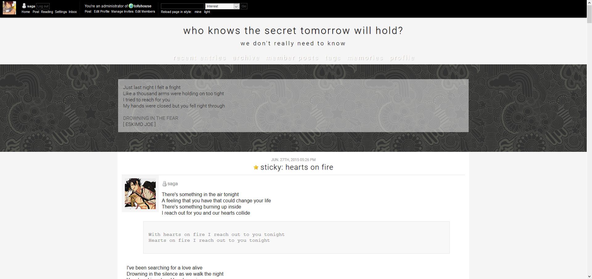 saga
saga saga
saga riotking + reading page + archives/archive day view, etc ]cawaii ]saga
 deathsight ]sagasaga
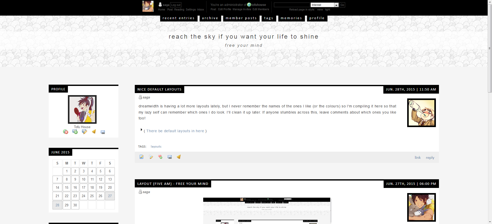
 saga - layout (Tectonic) - シノギ (dead pools)saga - layout (Five AM) - free your mind 2019saga - UPDATE: Dreamwidth's Responsiveness, now fixedsaga - layout (tectonic) - perfect strangerssaga - layout (tabula rasa) - crystal ballsaga - layout (tectonic) - blame it on mesaga - layout (Blanket) - silent picturesaga - layout (Brittle) - pull me deepsaga - basic layout coding notessaga - layout (Blanket) - burn your namesaga - layout (Patsy) - echosaga - nice default layoutssaga - layout (Five AM) - free your mindmomijizukamori